
Product Design Case Study by Sean Berger
My Contributions
Tools
Ashley has never used telehealth before, but understands it can be quick and cost-effective. She woke up with a migraine and wants to talk with a doctor about possible Covid-19 symptoms.
| Age | Occupation | Details |
|---|---|---|
| 25 | Classroom Teacher | First-time user |
Penelope accesses therapy through the Blue KC telehealth app. Ashley prefers to see the therapist she has an established relationship with, so she uses the app frequently to schedule appointments.
| Age | Occupation | Details |
|---|---|---|
| 31 | Travel Nurse | Expert user |
| Severity | Problem To Be Solved | Design Goals |
|---|---|---|
| Critical | Users must download a second app for Blue KC telehealth visits. | Eliminate the need for a specific telehealth app. Guide users from MyBlueKC web and mobile apps to their telehealth experience. |
| Critical | Users must register a second account for Blue KC telehealth visits. | Eliminate the need for login. Provide design leadership in discussions with architect and third-party partner to eliminate unnecessary tasks. |
| Major | Users must manually enter membership info which leads to typos and billing errors. | Work with cross-functional team and third-party partner to eliminate manual ID card step and other unnecessary tasks. |
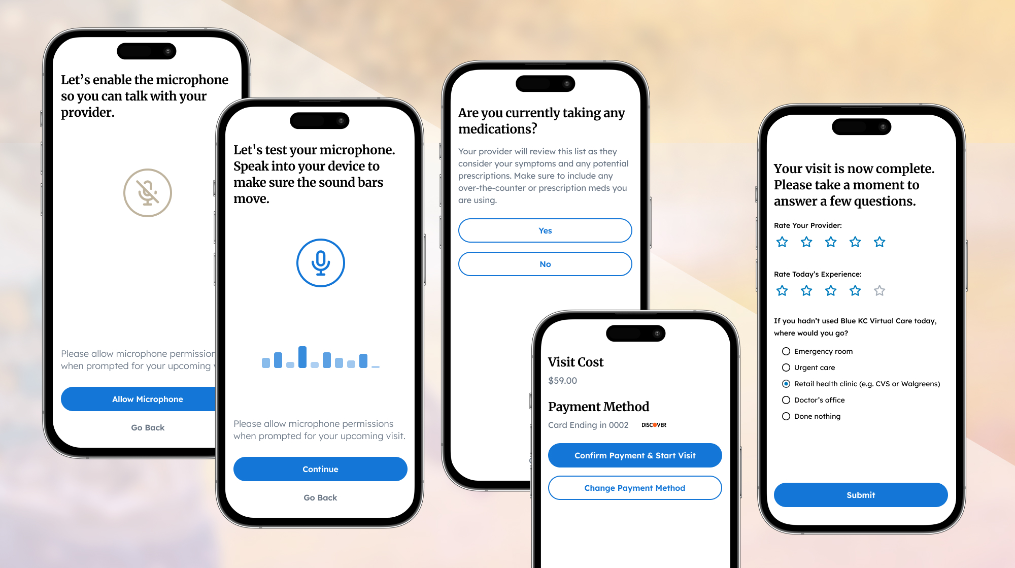
| Major | Visit costs are introduced at the end of the flow only before starting a telehealth call. | Design the end-to-end experience with useful, friendly content. Use teamwork to introduce pricing early. |
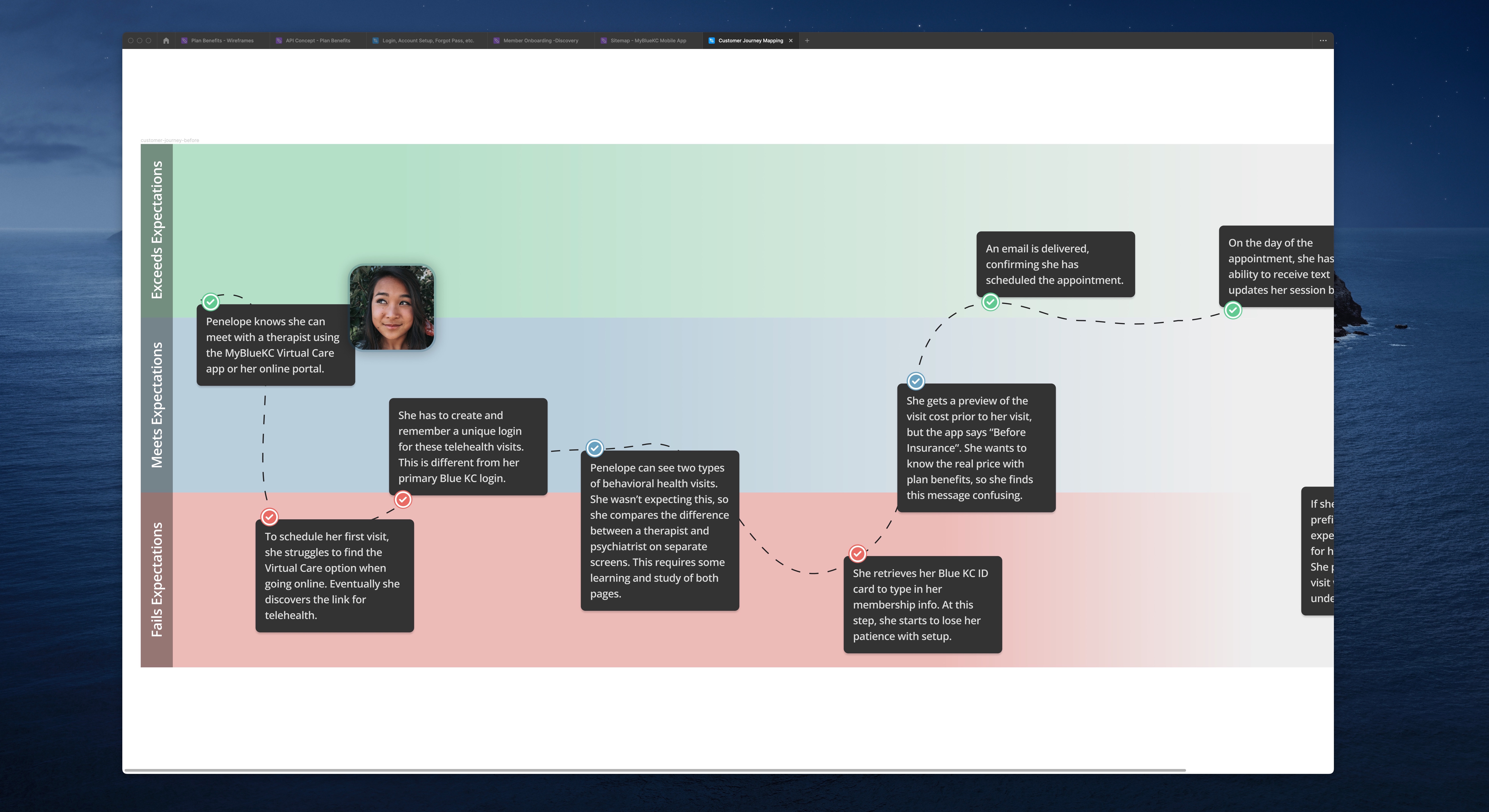
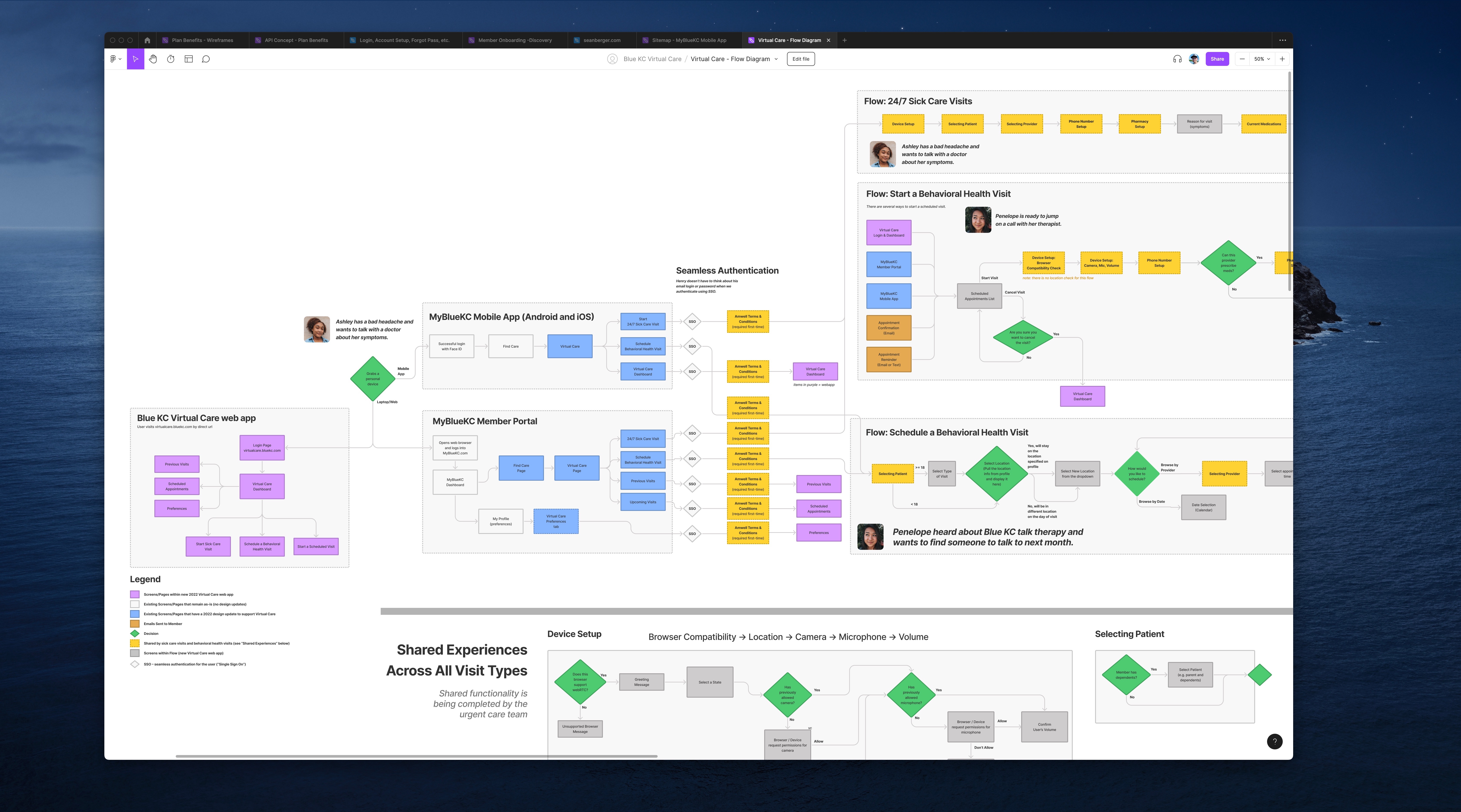
To visualize the end-to-end experience, I created a series of FigJam sticky notes. Each sticky represented a specific screen or feature users would interact with prior to a doctor visit. We discussed and debated the ideal flow. As we progressed, I transformed this series of sticky notes into a flow diagram to articulate the end-to-end experience:
My digital whiteboards and flow diagrams benefitted our teamwork in several ways:
I organized a usability study in parallel of design efforts. I wrote questions, recruited participants, created a testing schedule and moderated 1-on-1 sessions. I worked with the customer experience team to recruit end users.
| Format | Recruited Participants | Focus | Technology |
|---|---|---|---|
| Moderated | 7 active health plan members | 24/7 Sick Care flow | UserZoom, Figma prototype |
UserZoom allowed us to observe behaviors and interactions directly on the participant’s device. Team members from product, customer experience, marketing and engineering participated in observation. I sent meeting invites for individual sessions. Meeting invites helped the cross-functional team prioritize the research study on their calendars. We took notes as a team. I facilitated debriefs for individual sessions on FigJam.
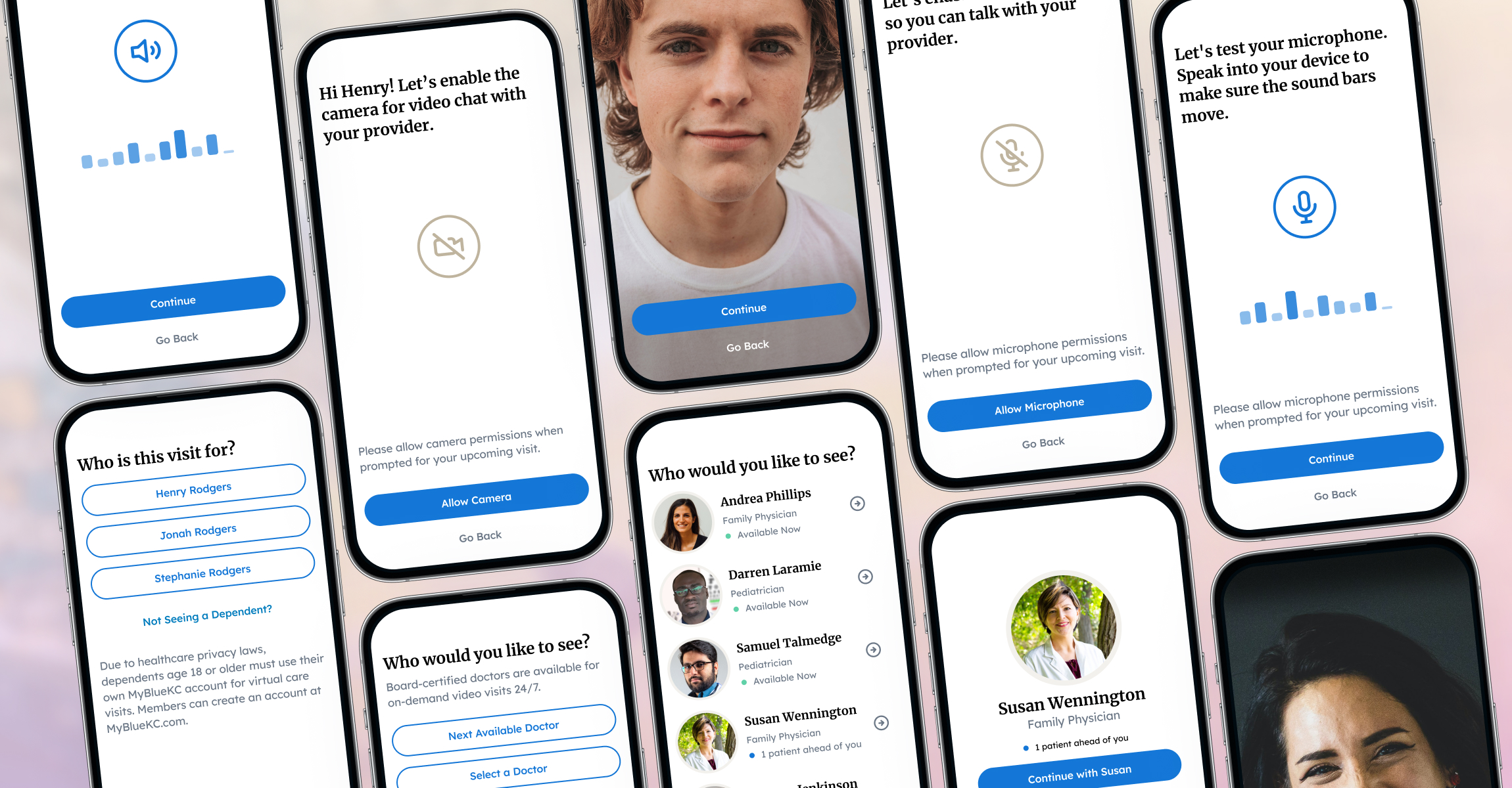
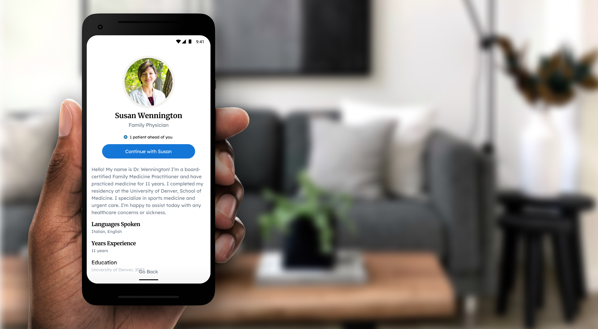
When users interacted with the proposed product in prototype, many aspects performed well. This was an improvement from the current state. We made it easy for users to authenticate to the telehealth platform, prepare their device for a video call, provide necessary personal info and select a healthcare provider.
Behaviors within the study led to consensus answers from participants. Mobile app users expected to start from the dashboard screen or hamburger menu.
We placed telehealth on the mobile dashboard and retested the task a few months later, when the ease of use score rose from 4.4 out of 10 to 8.0.
This was obvious heading into research sessions, but users confirmed it. Armed with that confidence, we eliminated pharmacy setup after more discussion with our partners with the third-party platform.
Users didn't understand the medical allergy options that were displayed by our SDK partner. We eliminated this screen by discussing with an internal practitioner and our partners.
Doctors need to know which medications a patient is taking prior to their telehealth visit. In user testing, users made it clear they didn't want to mess with this feature.
I re-tested an updated design with new participants in a study a few months later. Users felt the updated design made it easy to add and manage meds, or simply skip the question. I worked with the engineering team to implement an improved design following the re-test.
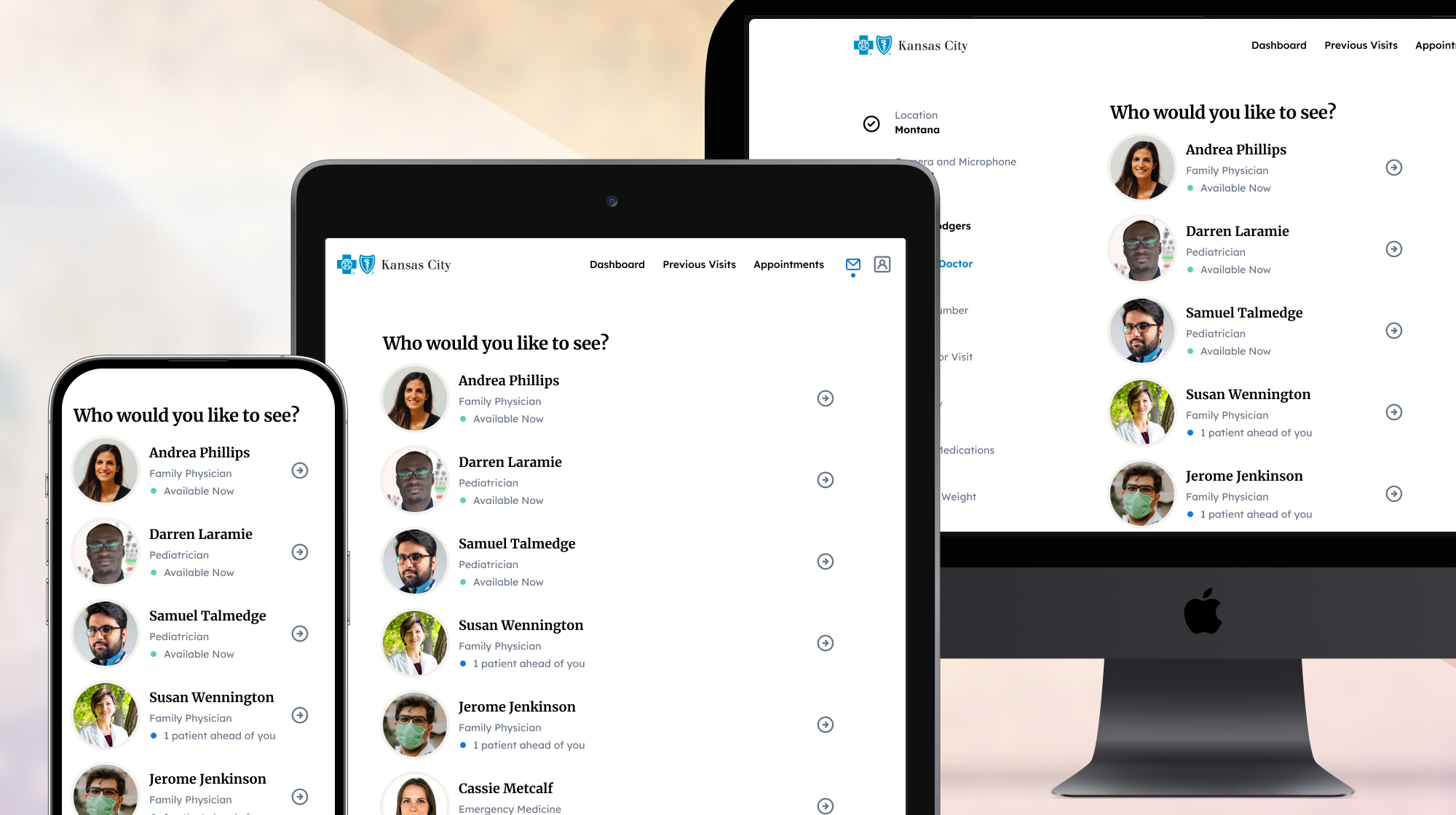
We shaped the scheduling flow using a friendly, conversational personality with no wasted words or tasks.
I worked closely with the project architect to ensure feasibility with our design approach. Business partners in product, customer experience and marketing collaborated closely to provide input on design and observe my usability tests. To meet our deadline, I worked alongside a team of nine engineers, guiding them with design documentation and hand-off meetings.
| Status | Problem To Be Solved | Outcome |
|---|---|---|
| Resolved | Users must download a second app for Blue KC telehealth visits. | Blue KC telehealth was seamlessly integrated into the existing MyBlueKC mobile and web products. |
| Resolved | Users must register a second account for Blue KC telehealth visits. | Users accessed telehealth providers using their existing Blue KC email and password. |
| Resolved | Users must manually enter membership info which leads to typos and billing errors. | Blue KC member info was seamlessly passed to the telehealth partner. |
| Resolved | Visit costs are introduced at the end of the flow only before starting a telehealth call. | Cost information was explained early in the flow, with content design that explained specific pricing. |