
Product Design Case Study by Sean Berger
My Contributions
Tools
As I started early discovery work, I reviewed a competitive analysis provided by the innovation team. The analysis outlined the availability and relative popularity of specific health plan features. Using this data, I worked with business partners to define a list of essential features that were “must-have” for our minimum viable product.
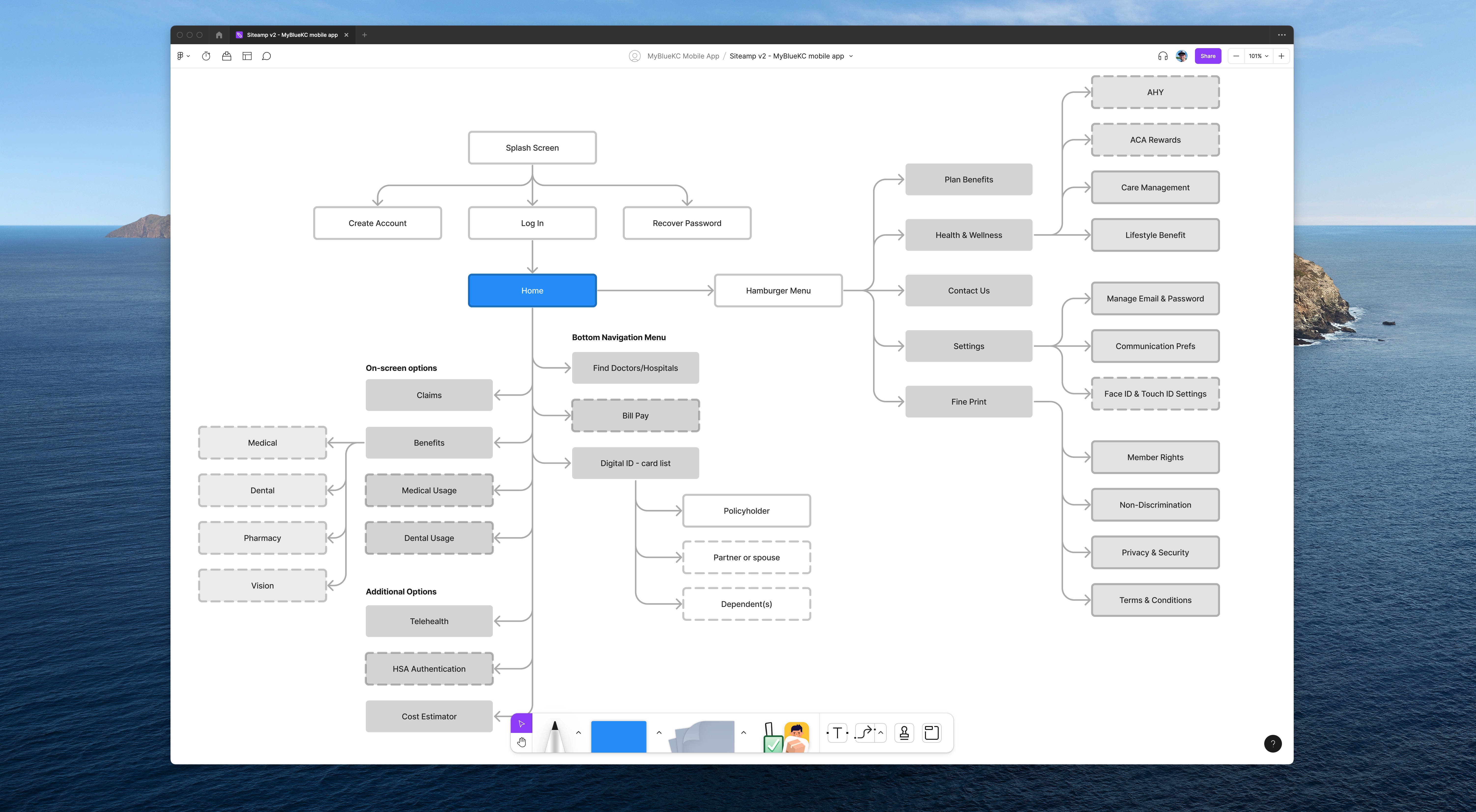
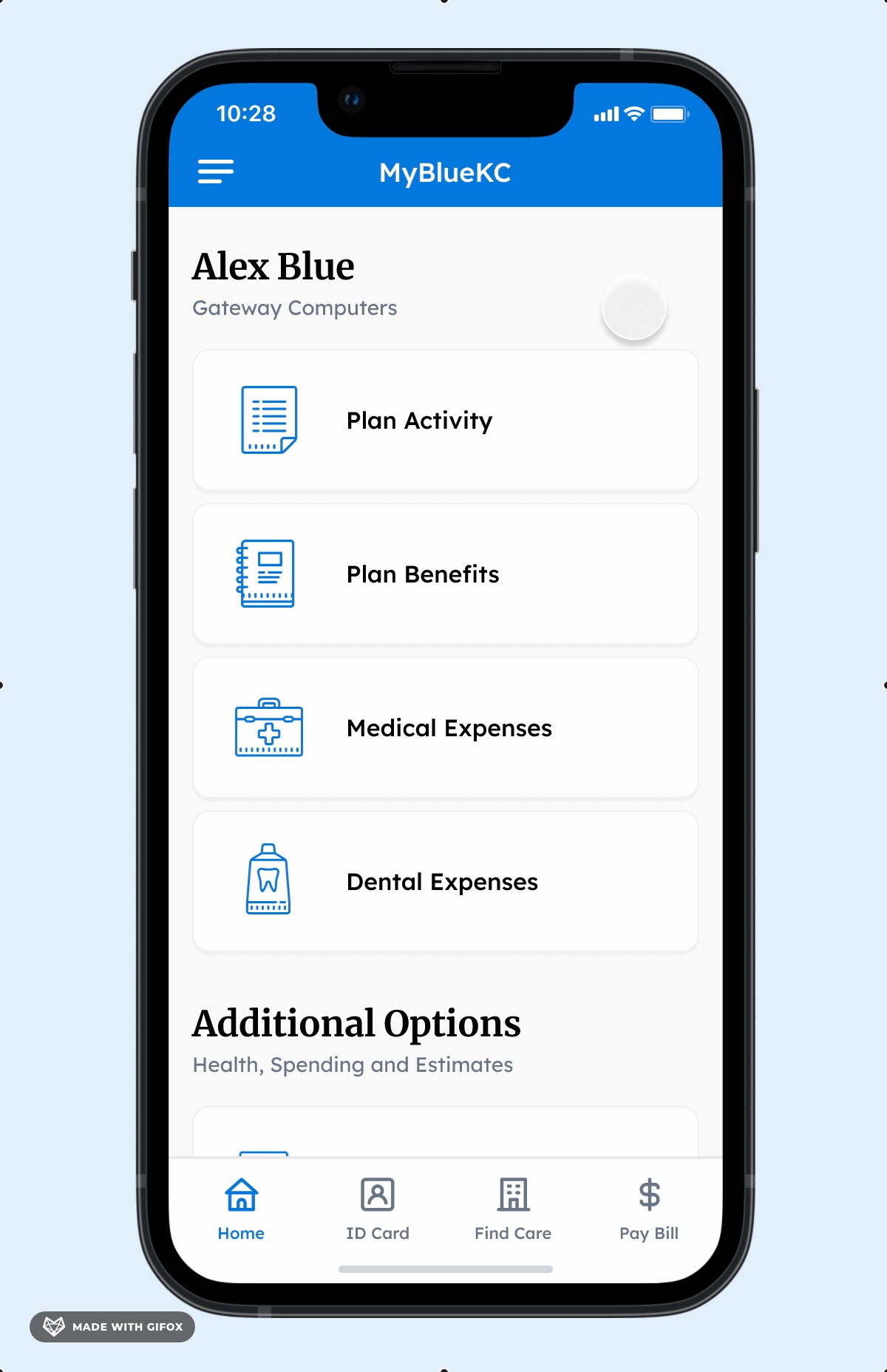
Must-have and popular features informed the work I did in creating a sitemap as one of my first design activities. Illustrating visual architecture for the app allowed the team to debate and determine where specific pieces of functionality would live.
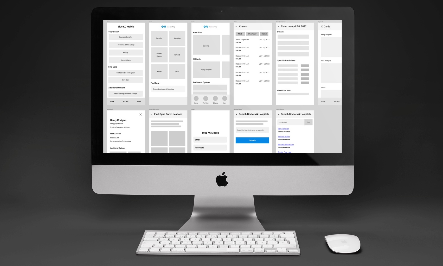
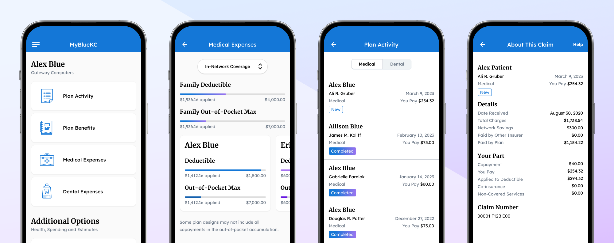
Some participants had used a mobile app to access their health plan, while many had never done so. Participants interacted with my Figma prototype directly on their personal device.
| Usability Study | Participants | Tasks Tested | Rate of Success |
|---|---|---|---|
| Round 1 (moderated) | 6 | 9 | 90.7% |
| Round 2 (unmoderated) | 6 | 10 | 93.3% |
| Round 3 (unmoderated) | 6 | 11 | 90.9% |
At the end of each session, participants were asked to rate the usefulness of the overall experience, with 10 as a perfect rating. The collective rating across all 18 participants was 8.23. Blue KC targets a rating of 8+ in all customer experience initiatives. The usability of the product design was an early success story for the team.
“Better in my opinion than the Blue KC website… Great starting point and I would love to give it a try.”
– Round 3 Participant
“Absolutely would use this. Love the layout, I think it’s clean, I think it’s neat.”
– Round 2 Participant
“Yes, it has a lot of information I need. I would definitely be glad to use this app.”
– Round 3 Participant
“Definitely very organized and easy to use.”
– Round 3 Participant
“The sessions led to some very relevant and actionable feedback on the app experience. The process was so valuable that we should strongly consider making this a standard, ongoing practice for all member platforms.”
– Jason S., VP and Chief Innovation & Strategy Officer
Putting a prototype in front of users allowed us to find and research potential usability issues. During and following research, I collaborated with business partners to revise designs prior to our first release.
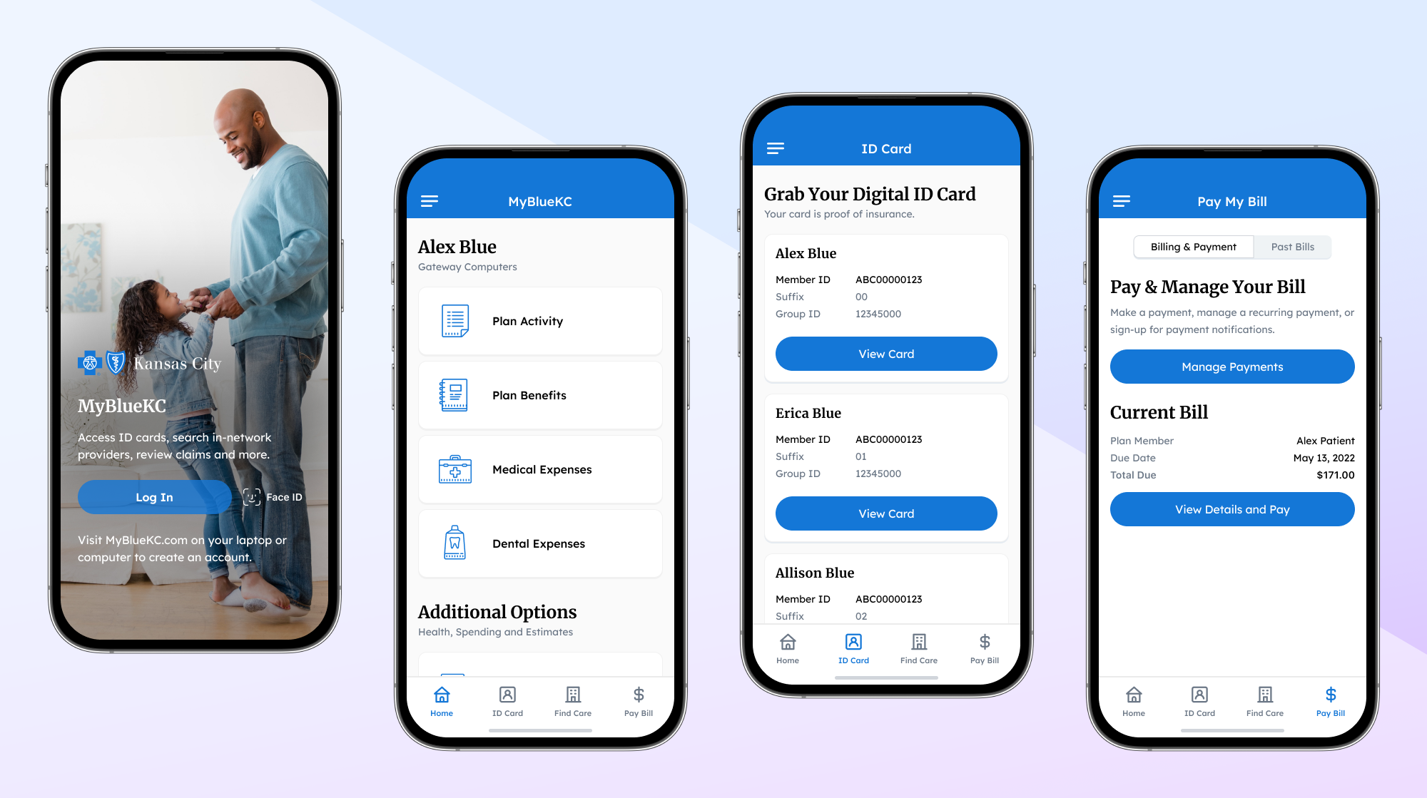
I consulted with customer experience leads to determine the popular features based on existing web analytics and popular topics from call center data. Below is an animated tour of features available from top-level navigation.
The left-swipe cards for individual family members were intuitive and well-received in usability studies:
To summarize, I led design and user testing efforts, then shipped the end-to-end experience of a new mobile app in six months. I shaped the design vision for this product using cross-functional collaboration with customer experience advocates, digital marketing leads and a team of four engineers. It was a true team effort.
“This was one of the highest-performing teams that I’ve seen at Blue KC. Sean did a great job of communicating effectively to business leaders... Sean does a great job working with individual contributors across the company. He continually receives praise from these business partners.”
– Chris B., Director of Digital Experience
Within months of the first release, the marketing team promoted the new app to users. Introducing this mobile app gave Blue KC’s member population a new and verifiably-easier method to access health plans than its web alternative.
The organization partnered with a third party to survey its member population over a one-year period to derive customer satisfaction:
| Product | Score (out of 100) |
|---|---|
| MyBlueKC mobile app | 81.67 |
| MyBlueKC web app | 79.33 |
| Overall Satisfaction with Blue KC | 72.24 ² |
| First 5 Months | 5,582 (77.7% iOS) |
| To Date | ~78,000 |
I executed user testing efforts for this opportunity in parallel to my design responsibilities. The organization didn't staff a research specialist, so I took initiative to create the strategy, write usability studies, recruit and screen participants, analyze results and produce findings. Observation strengthened my empathy skills as an employee and grew my humility as a designer. This project gave me a big opportunity to lead as a user researcher.
I've been on the consumer side of a few different health plans but there is no replacement for learning industry jargon and growing as a subject matter expert. I'm grateful to teammates who took time to educate me in the moments when features were less than straightforward.
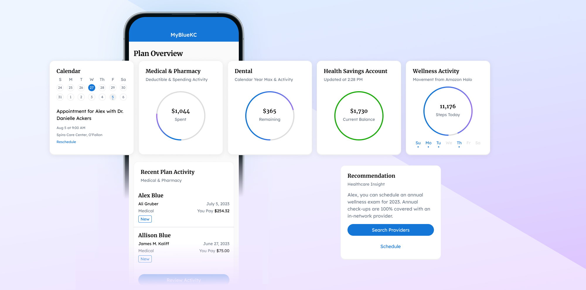
These concepts cast vision for what could be while reducing operating cost, eliminating friction and building upon the existing product.
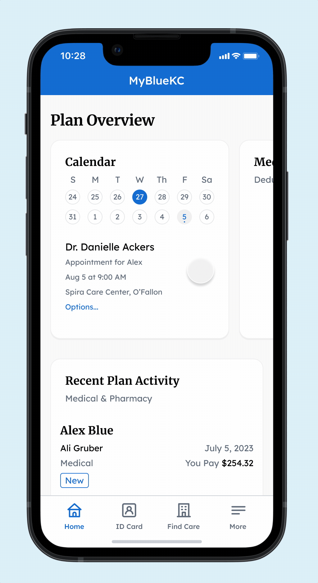
The dashboard in current state doesn’t properly inform users who need to consider the financial impact of an upcoming medical expense. Users are a few taps away from their deductible progress and savings balance.
Using design, bring data to the dashboard. Give users immediate answers on their deductible, savings balance and costs associated with recent visits. Add features and recommendations to encourage healthy behavior.
Users are forced to create an online account with a third-party web app just to schedule with a doctor at Spira Care.
Using design and services, give users the ability to schedule and manage Spira Care appointments directly from the mobile app.